From an open concept to a top-rated connected-car app
Leading the design of Honda's official connected-car app — from strategy to the final solution design
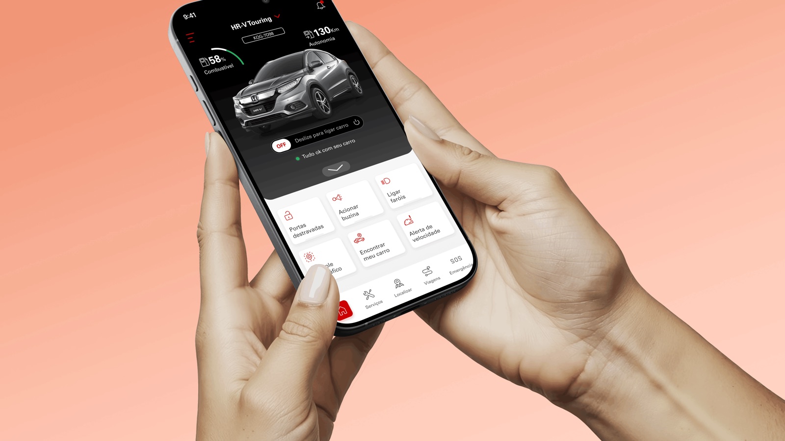
The home — remote controls within reach. Ideally a short clip of a remote command firing (start the car or the AC).
How I led the design of Honda's official connected-car app — from an open concept, through strategy and research, to a shipped product. Today it sits at 4.9 on Google Play, with 100k+ downloads.
A defined scope, but an open concept
My Honda Connect is Honda's official connected-services platform — remote vehicle controls, real-time information, a layer of safety and protection, and the relationship with Honda, all through the car's telematics.
Honda arrived with the strategy and feature scope already set, but the concept wide open — no consensus on which path had the best cost-benefit. On top of that sat Honda's own complexity: a company with many layers of management, where one product decision crosses many areas. So the real challenge was never “which features” — it was turning an open concept into a defined experience, inside an organization we first had to learn to move through.
Honda brought two anchors: the closed scope and strategy, and a set of market research we used as a base. Our job from there was to lead the design strategy and the research — cutting the ambiguity down to a direction the team could build with confidence.
Understanding Honda from the inside, the user from the outside
To avoid designing in the dark, we ran discovery on three fronts.
-
Inside Honda
Seven interviews across different areas — marketing, CRM, commercial sales, technical publications and more. They surfaced each area’s expectations and concerns, and how each could support us along the way. In a company with many layers of management, this is what gave us the read on how decisions get made and how the product would reverberate across the org.
-
The user
Interviews with extreme-profile users — experienced drivers with a repertoire across many cars and real familiarity with connected-car apps. Extreme profiles because they expose the limits of the experience: what this kind of user expects, where the tech usually frustrates, and what has already become a settled expectation in the category.
-
The category
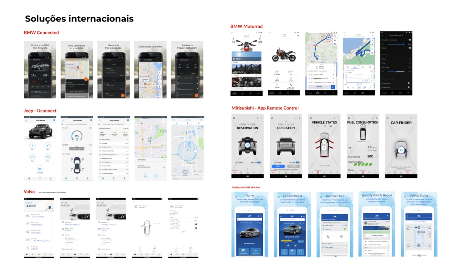
A benchmark of national and international solutions — how this kind of product is offered around the world: features, experience quality, each competitor’s strengths and weaknesses. It became one of our most important bases for calibrating what was category standard, what was a differentiator, and where Honda had room.
We consolidated everything into an executive report — the research translated into decision inputs to carry into the workshop.
Three days to close the scope — and decide
With the report in hand, we took everything into a three-day workshop with the design team and Honda's business team. The goal was to walk out with a decision, not with more options.
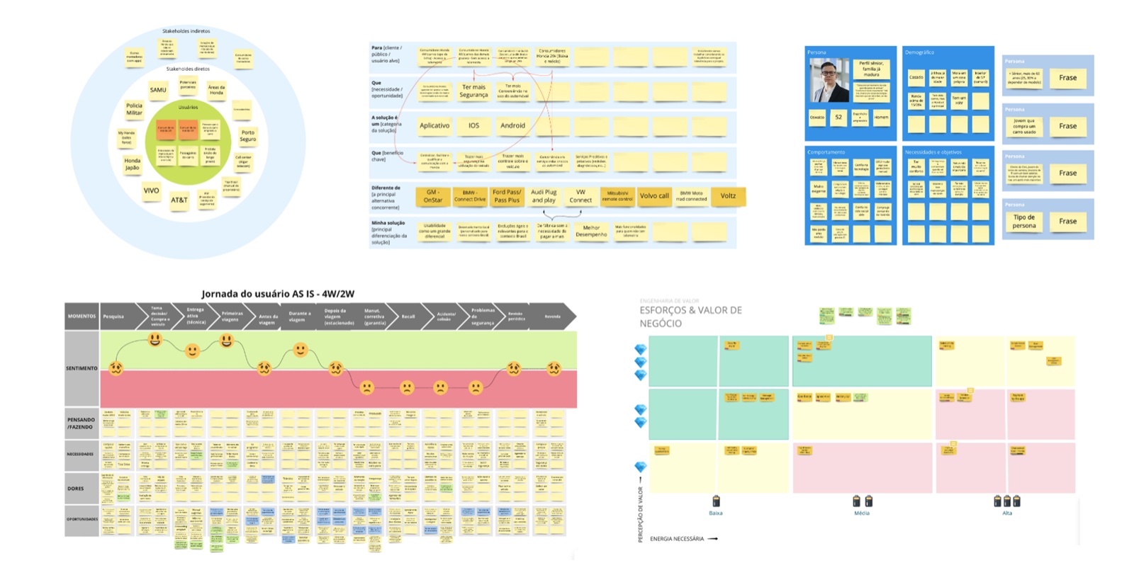
Over the three days we explored opportunity areas and the user journey, and landed two concrete outputs: the product’s final scope, aligned between design and business; and an experience base — including a first pass at the screens of what a good experience would be. That base left the room already validated across the parties, and became the starting point for the design team to build the final experience.
The workshop turned that stage into an artifact-based agreement: a stakeholder map to know who really depended on the product, an opportunity canvas connecting each Honda audience to a need and a differentiator, and personas built straight from the research. From there, we mapped the user’s AS-IS journey with the car — from purchase intent through the first trips to service and renewal — and used the friction and sentiment we found there, together with the business’s own priorities, to close the product’s scope with real confidence, not just a room full of people agreeing.
Turning a big product into a navigable one
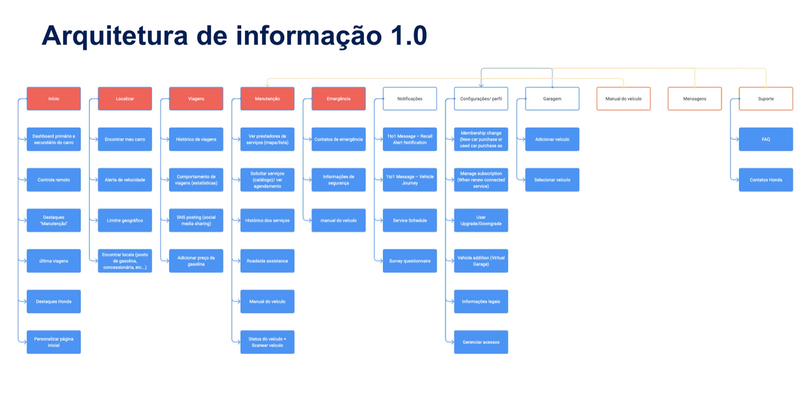
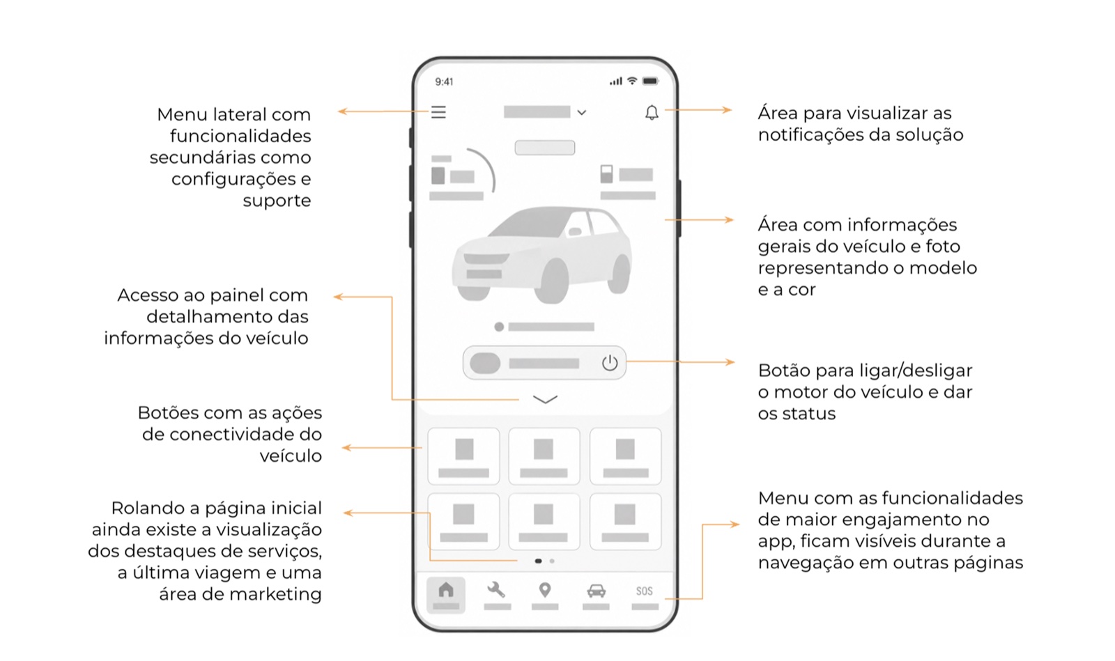
With the scope closed and the experience path set, we hit two fronts in parallel. First, information architecture. Given the product’s size — remote controls, vehicle status and health, services and scheduling, trips, location and geofencing, multi-profile (main driver, limited-access driver, fleet admin), plans and subscription — organizing that complexity into a clear, navigable hierarchy was a central decision. We defined how things group, what earns a place on the home, and what sits one tap away.
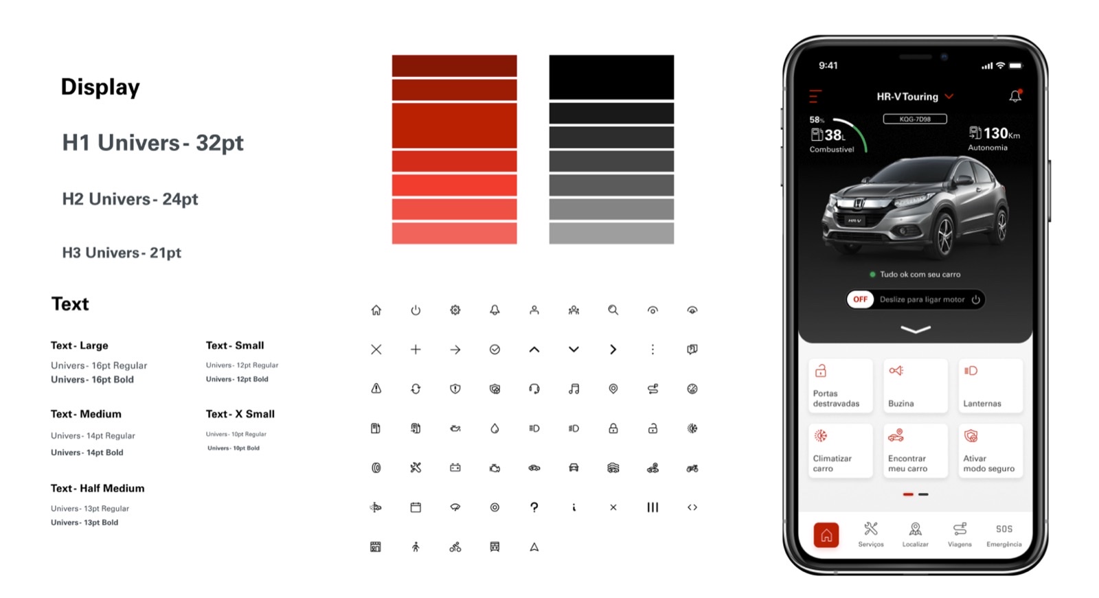
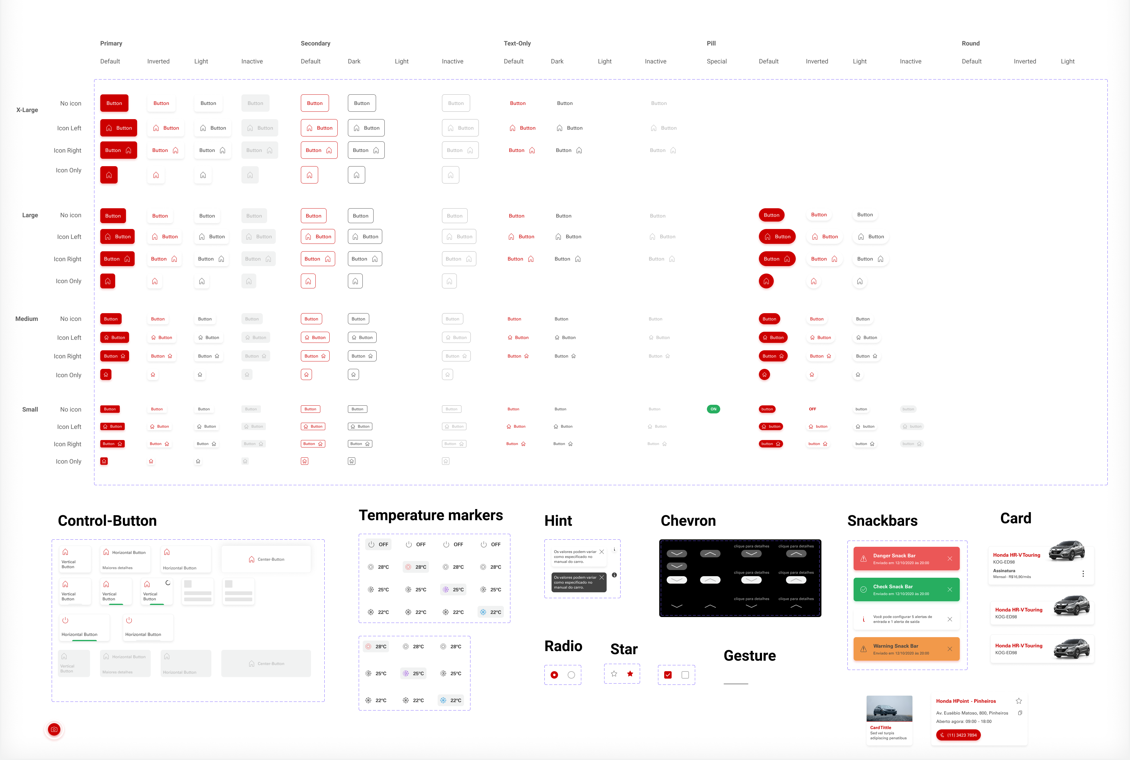
In parallel, we built the design system — typography, color and the rest of the visual language. One deliberate choice: we took Honda's visual identity as the reference, but built the design system from scratch, tailored to the app. Nothing was inherited from an existing Honda solution.
Validated, tested, then shipped
With architecture, experience and layout tied together, we reached a high-fidelity prototype and validated it with Honda's team.
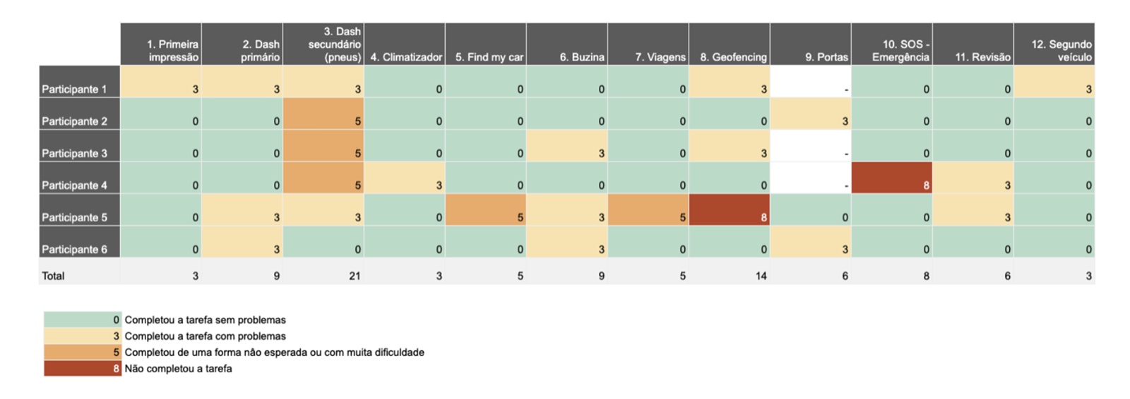
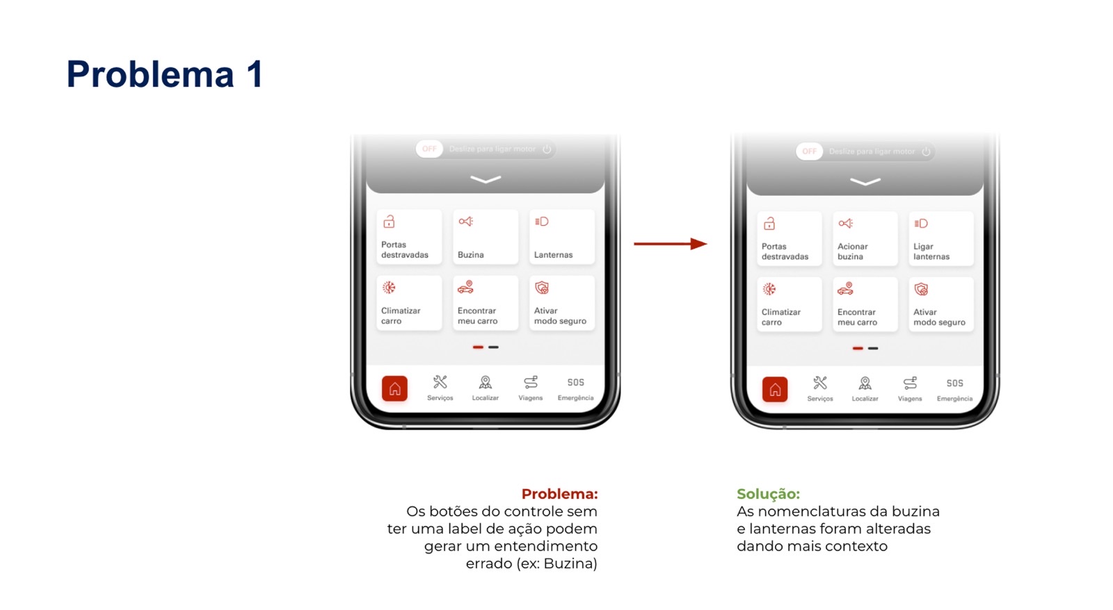
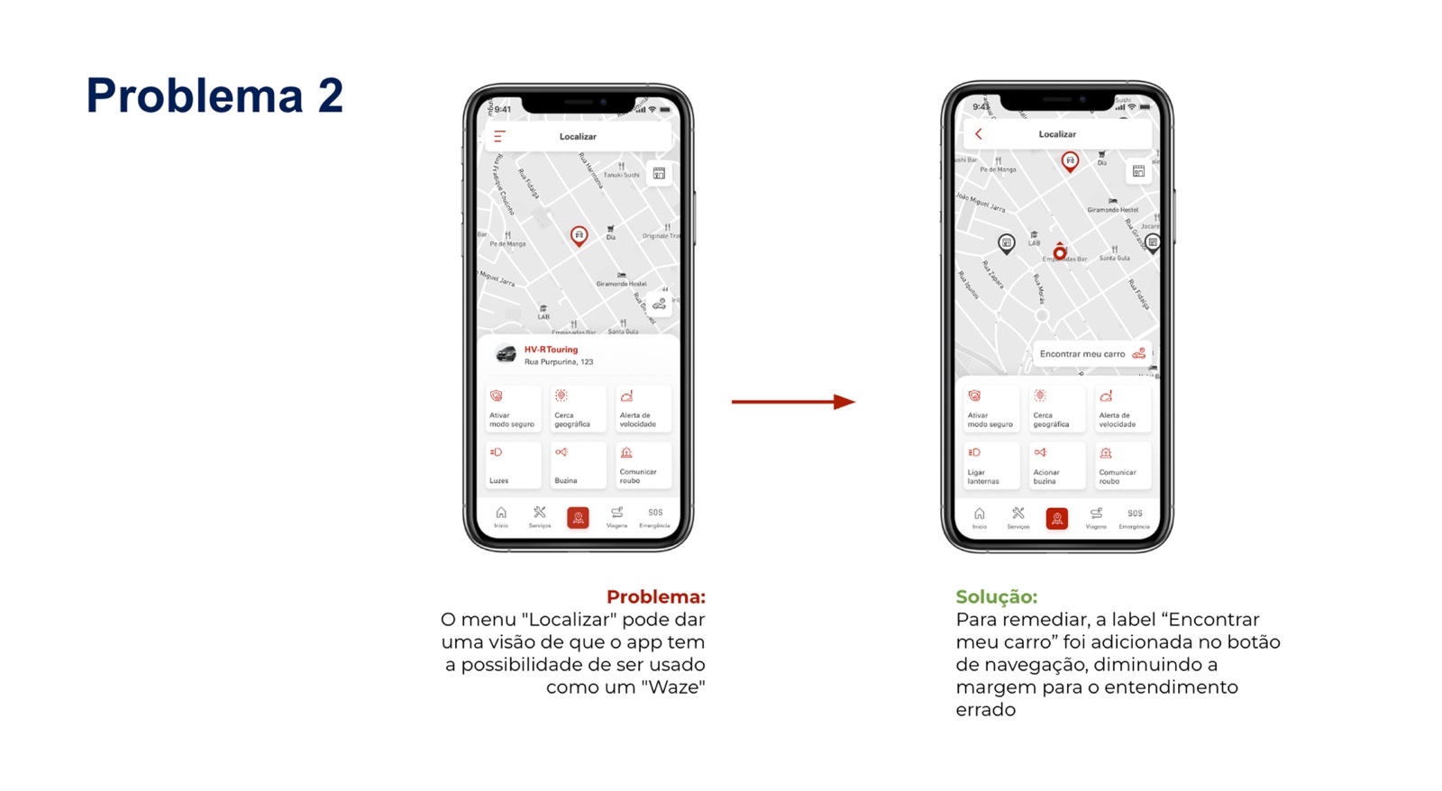
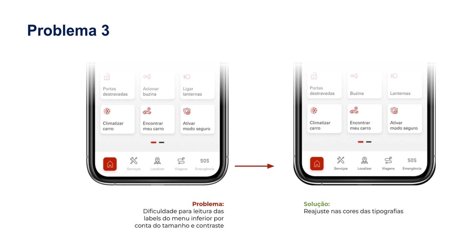
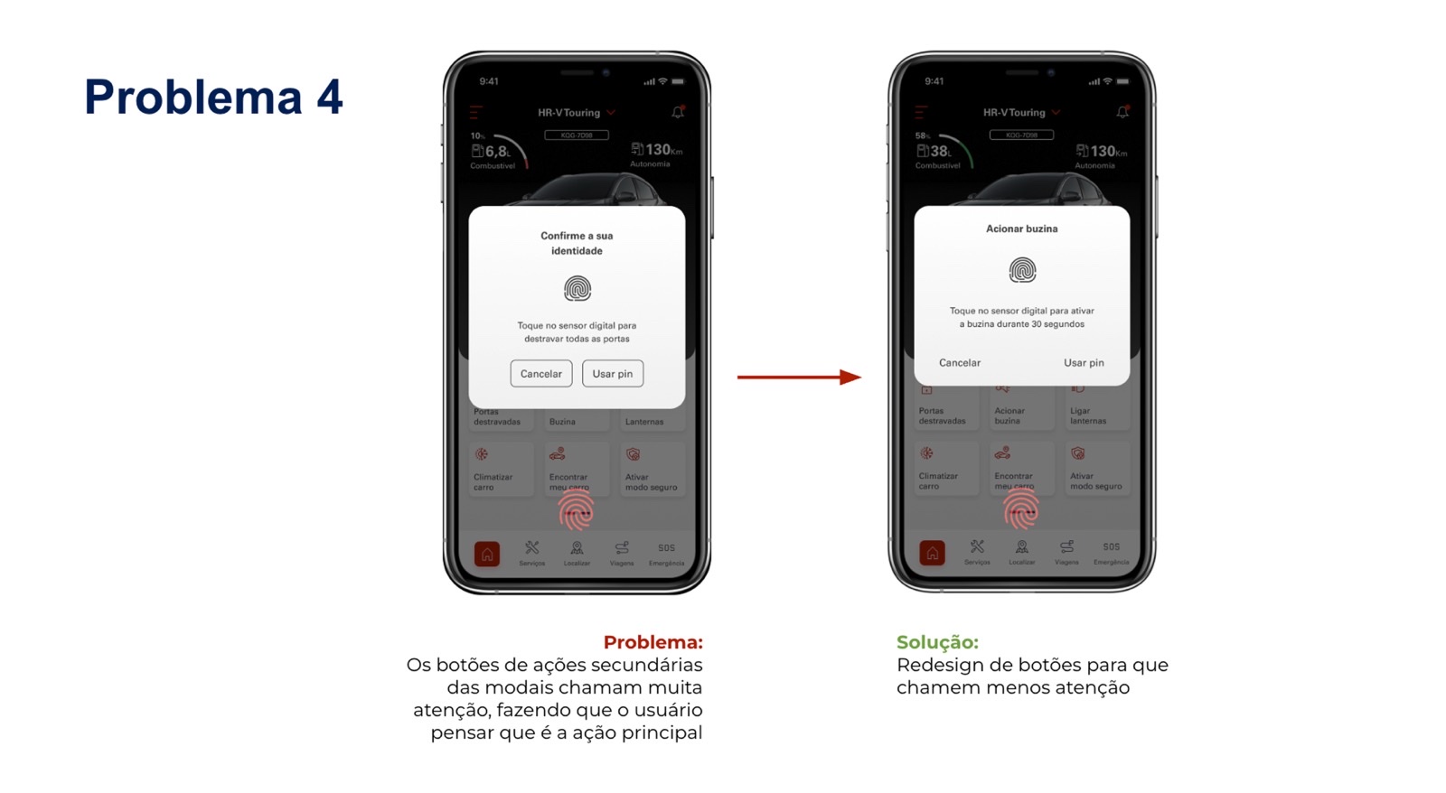
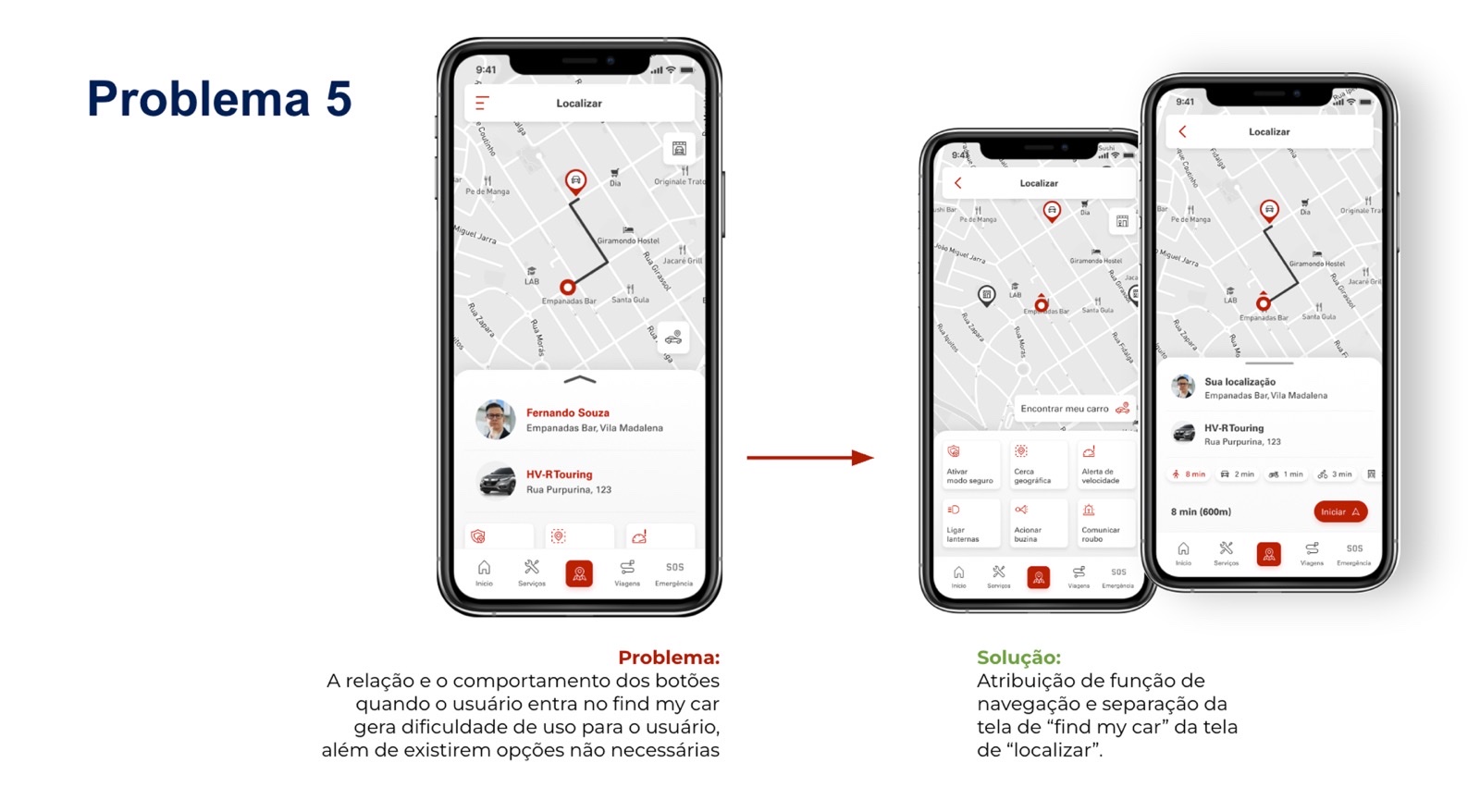
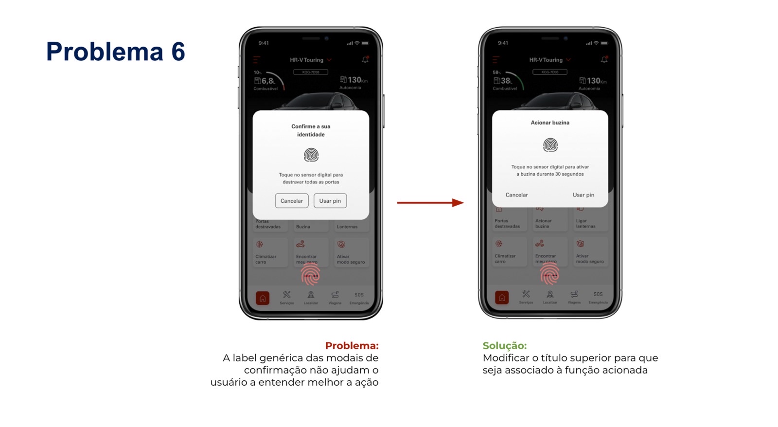
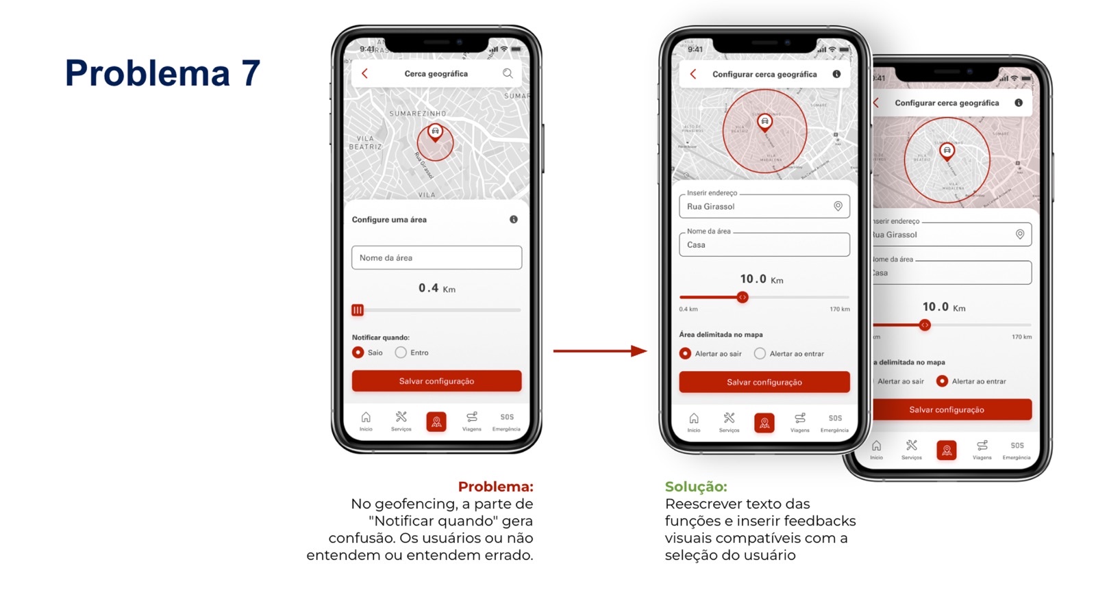
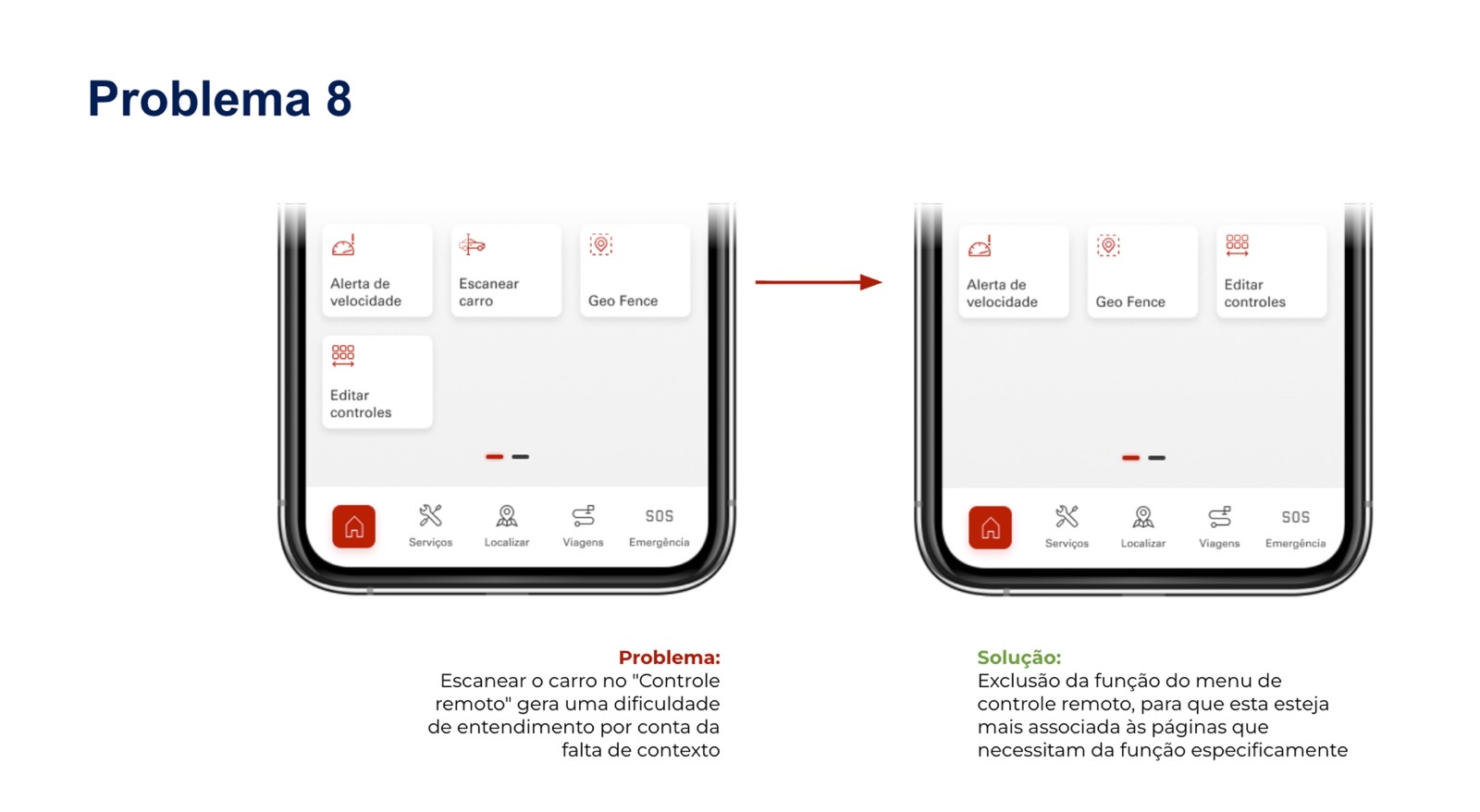
After the internal validation, we ran a usability test with six users. It produced a set of learnings, and from them a round of adjustments and improvements that went into the first implemented version of the app.
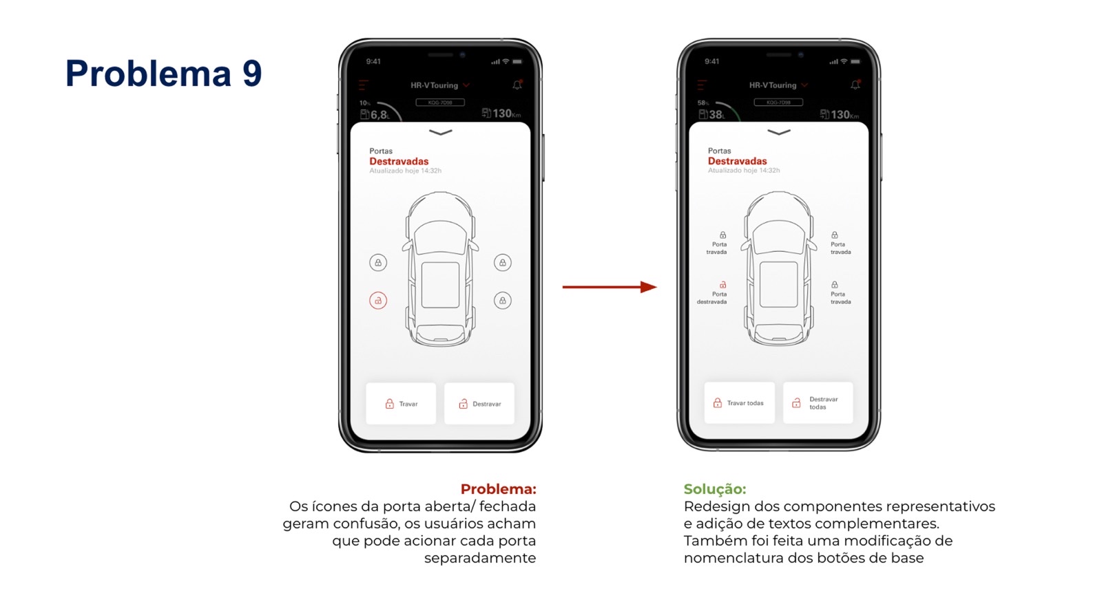
Nine problem/solution pairs that came out of those sessions.
Convenience, safety, relationship
-
Convenience
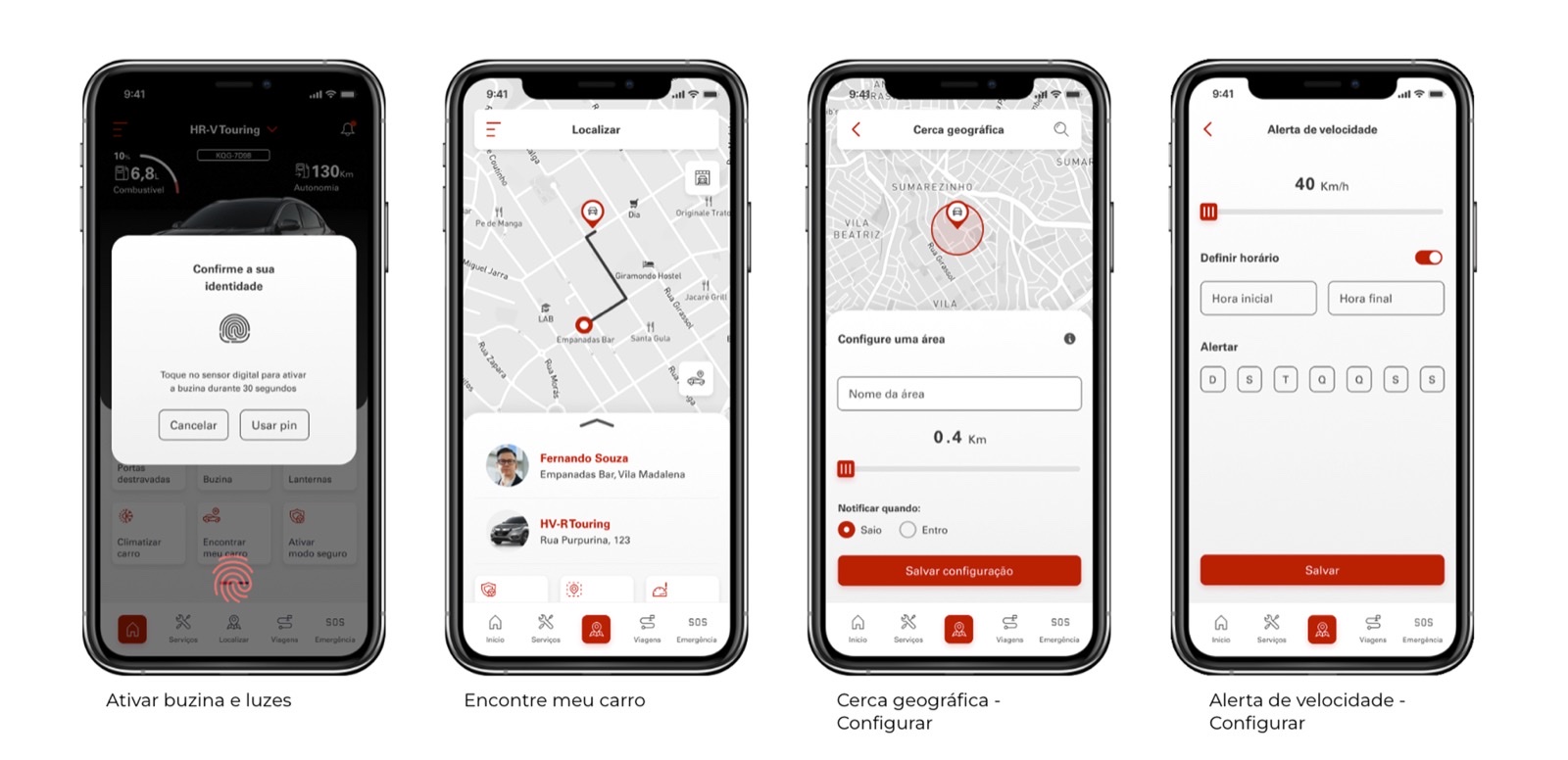
Remote controls in the palm of your hand: start and stop the car and the AC, lock and unlock the doors, find the car in the parking lot.
-
Safety & protection
Real-time vehicle information, collision alert, alarm, tracking and geofencing — with an authentication layer (PIN / biometrics) guarding the remote commands.
-
Relationship & services
Service scheduling, history, manual and assistance — keeping the customer close to Honda after the sale.
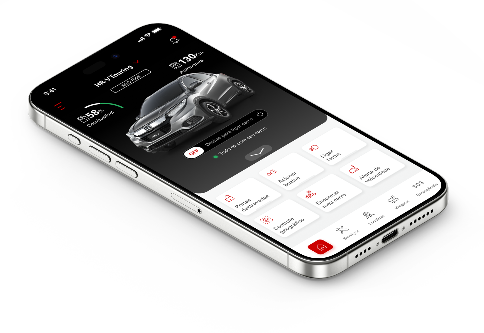
The main screens, end to end.
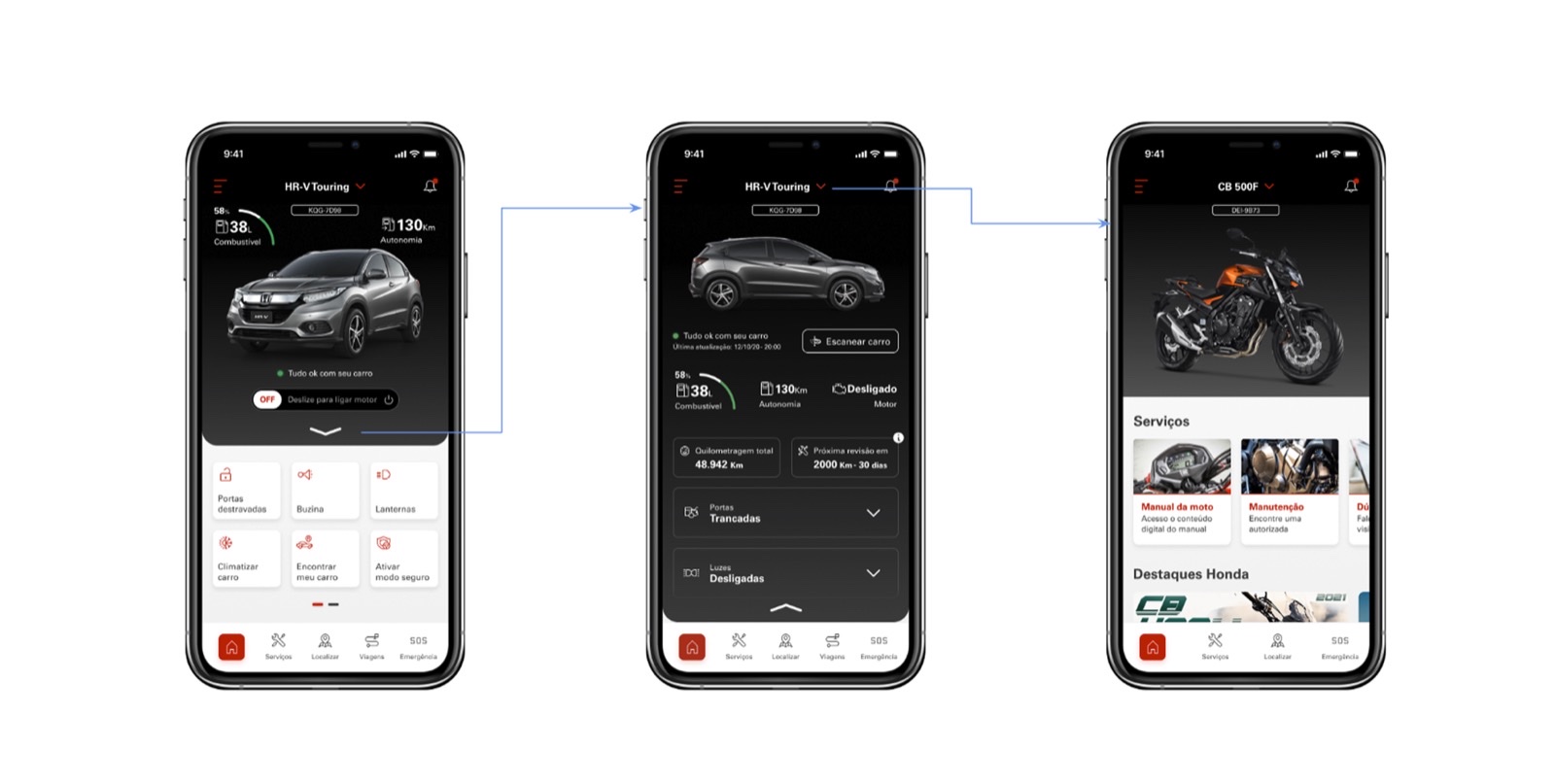
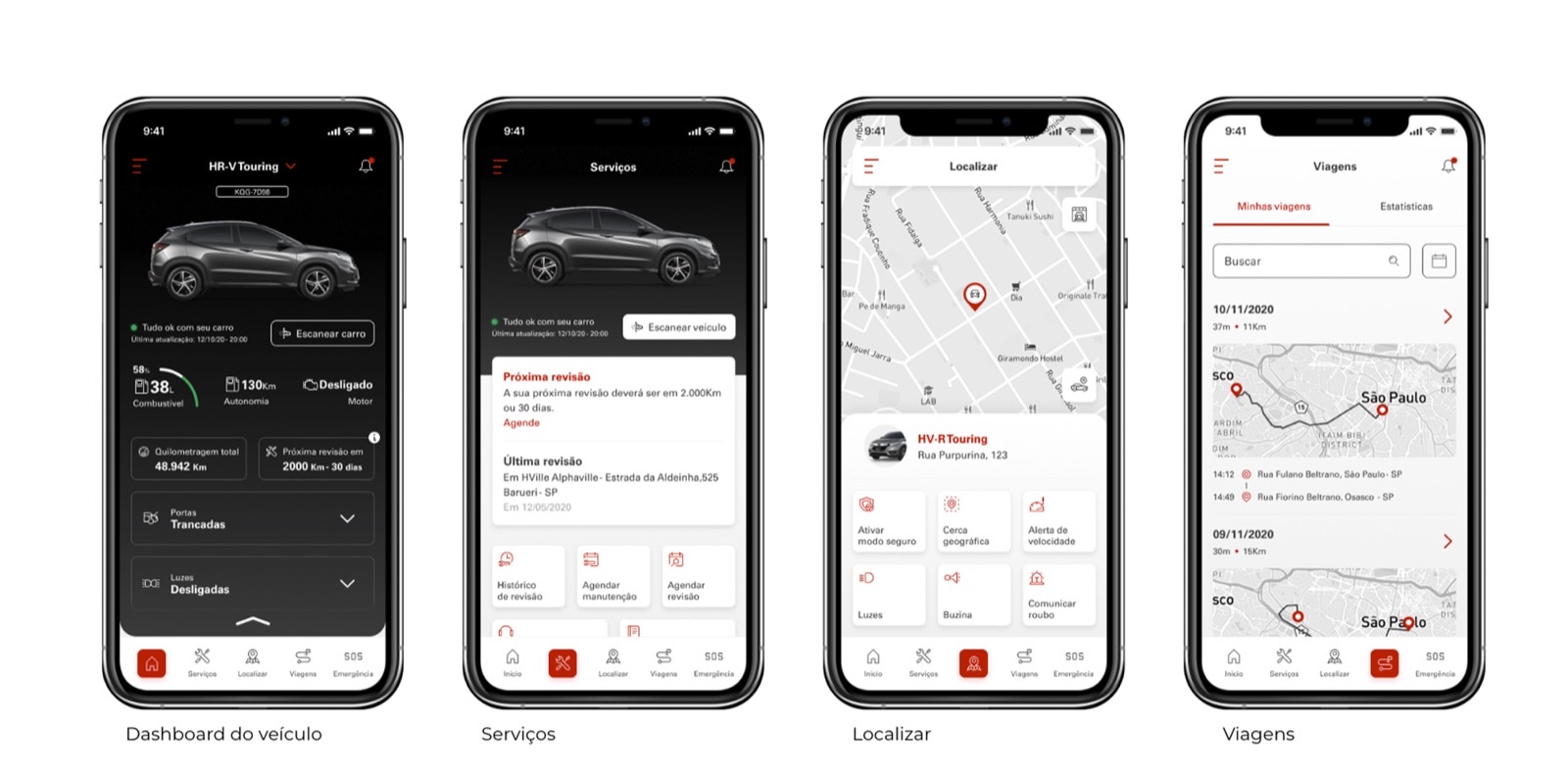
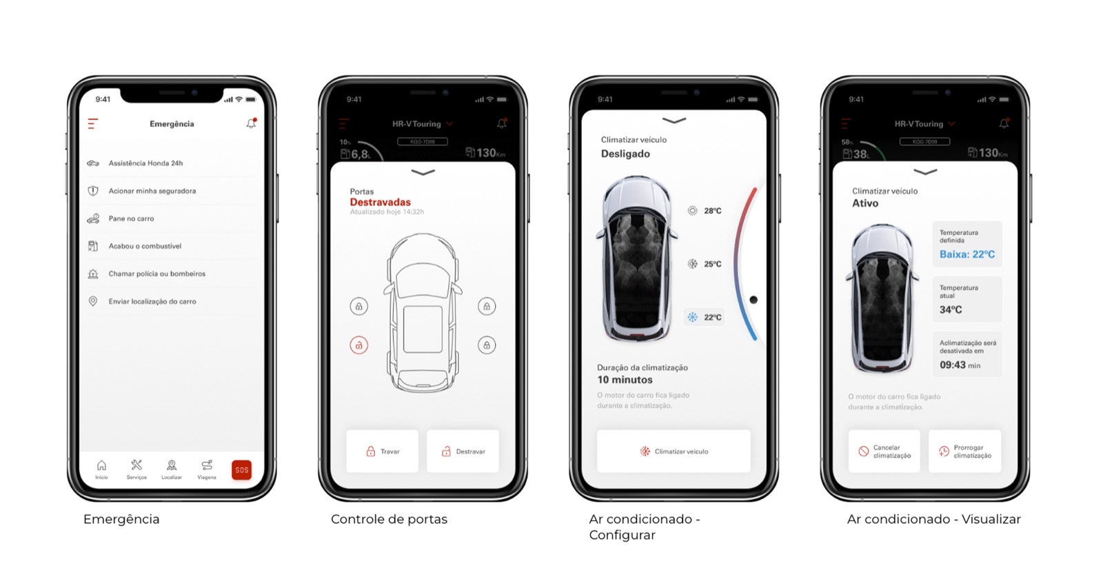
The interface sits on a design system built from scratch for the app — buttons in every size, style and state (default / inverted / light / inactive, with and without icons), plus the app’s custom control buttons, temperature markers, hints, chevrons, snackbars and card patterns. All built as Figma components so a state change to one variant propagated everywhere it lived.
Live, and still growing
I worked on this from the initial concept through the first version of the app's design, leading the product-design front alongside a mid-level UX designer and a mid-level UI designer. The app is still live and evolving with other teams today, on a base very close to what we defined in the project — I no longer work on it, so the current store numbers reflect the product I helped originate, not a result I can claim alone.
- 4.9 / 5
- Google Play rating
- 4.8 / 5
- App Store rating
- 100k+
- Downloads (Google Play)
Current store figures — among the highest in the category. Download counts are only official on Android; Apple doesn't disclose them, though the App Store's review volume and rating suggest a similarly sized base. These reflect years of work by many teams since; I led the initial experience through the first version of the app's design and no longer work on the product.
